Simple Banner Layout Rules That Improve Clicks And Readability
Banner ads live in a strange corner of the internet. They have to communicate fast, look credible, stay readable on tiny screens, and still feel worth clicking, all while competing with content people actually came to see.
When banners underperform, the problem rarely comes down to “bad design taste.” Layout is usually the real culprit. Poor hierarchy, cramped spacing, unclear focal points, awkward CTA placement, or copy that takes too long to process all quietly drain performance.
The rules below focus on layouts that scan cleanly, stay legible across sizes, and give the eye an obvious path from message to action. Every principle here is grounded in reputable UX research, ad platform guidance, and industry standards.
Why Layout Beats “Better Graphics” Most Of The Time
Click behavior on banners is driven by speed. Users glance, decide, and move on.
Eye-tracking research from Nielsen Norman Group shows that people regularly ignore elements that look like ads, sit in ad-like locations, or use ad-like styling. That behavior shows up on mobile and desktop alike.
Layout controls two outcomes that decide everything:
- Whether the banner gets noticed at all
- Whether the offer is processed fast enough to earn a click
Once layout becomes clean and predictable, creative details finally get room to work. Product imagery, copy, offers, branding, and CTAs all perform better when the structure supports them.
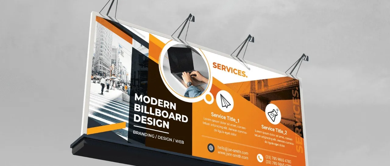
For teams that want to apply solid layout structure quickly, tools that let you build your banner design in minutes help translate layout principles into usable creatives without friction.
Rule 1: Build A 3-Second Reading Path (Message → Value → Action)
A banner can look polished and still fail if the eye does not know where to land first.
Visual hierarchy guides attention through contrast, size, grouping, and position. In banners, a simple reading path consistently performs best:
- Primary message (headline)
- Value detail (benefit, qualifier, or offer)
- Action (CTA)
When a banner introduces more than 3 meaningful stops, scanning slows and drop-off increases.
Practical Layout Moves
- Make the headline the largest text block
- Keep the support line focused on one idea
- Isolate the CTA so nothing competes with it
Guidance from Google on responsive display ads reinforces short, clear headlines and discourages generic or clickbait phrasing.
Rule 2: Pick One Primary Focal Point, Not Three
A banner can only do one main visual job at a time.
Common focal point choices include:
- The product itself
- A person’s face angled toward the copy
- A clear offer like “20% Off”
- The CTA button for familiar products
Problems begin when the layout elevates multiple elements equally. Product image, discount badge, oversized logo, and bold CTA all shouting at once split attention.
A Clean Priority Stack
- 1 hero element
- 1 message block
- 1 CTA
- 1 brand marker
Everything else supports that structure.
Rule 3: Use One Grid And One Alignment
Grid discipline quietly separates polished banners from chaotic ones.
Layout Structures That Consistently Work
- Left copy, right product
- Centered copy with CTA below
- Background image with text overlay inside safe margins
Alignment Rule
Choose one alignment for text blocks, left or center, and stick to it. Mixing alignment inside a small banner creates visual noise and slows reading.
Rule 4: Leave Real Breathing Room, Even In Small Sizes
White space is not wasted space. It makes banners readable at a glance.
Cramped layouts trigger friction before users even decode the message.
Spacing Habits That Protect Readability
- Add padding around the entire banner
- Leave visible gaps between headline, support copy, and CTA
- Keep logos away from edges
- Avoid stacking text too tightly
The IAB Tech Lab fixed-size specs recommend clear separation between ads and surrounding content. Microsoft requires a visible 1-pixel border so ads do not visually merge with page content.
Borders may feel unexciting, but they help banners behave properly in real placements.
Rule 5: Keep Copy Short Enough To Read Without Effort
Banner copy should feel closer to signage than to landing page writing.
Responsive display best practices from Google emphasize sentence case, clarity, and concise phrasing, with guidance around character limits such as 80 characters for descriptions.
Copy Length Targets That Work
- Headline: 3 to 7 words
- Support line: 5 to 12 words
- CTA: 1 to 4 words
If copy needs more explanation, the banner is trying to do the landing page’s job.
Copy Layout Habits That Help
- Break longer phrases into 2 lines instead of shrinking font size
- Avoid all caps for readability
- Skip thin fonts on busy backgrounds
Rule 6: Treat CTA Placement Like A Layout Anchor
A CTA is where scanning turns into action.
When a CTA floats inside clutter, hesitation increases.
CTA Layout Rules
- Give the CTA its own zone
- Keep it away from the logo
- Use a clear button shape or boundary
- Use action-based language like Shop, Book, Get, Download
The IAB emphasizes clear user initiation, even for static banners.
Mobile Sizing Matters
Touch targets that feel cramped cause missed or accidental taps. Accessibility guidance from WCAG recommends targets around 44 by 44 CSS pixels.
Smashing Magazine explains why physical screen differences make that sizing practical, not theoretical.
Even when the full banner is clickable, a well-sized button reduces hesitation.
Rule 7: Never Sacrifice Contrast For Visual Mood
Low contrast might look refined in mockups. In live placements, it fails.
Banners appear across:
- Dark mode interfaces
- Busy page backgrounds
- Different brightness settings
- Compressed image delivery
Reliable Contrast Choices
- Place text on solid blocks or gradient overlays
- Avoid thin text directly on photos
- Keep text colors consistent
- Make CTA colors clearly distinct
Visual design principles from NNGroup reinforce that hierarchy depends on contrast and scale to signal importance.
Rule 8: Use Logo Placement That Signals Brand Without Dominating
Logos matter, but oversized logos crowd out the message.
Logo Placement Rules
- Position logos in corners
- Keep logos smaller than headlines
- Leave padding around them
- Avoid placing logos next to CTAs unless space is generous
Banners sell first. Branding supports that job.
Rule 9: Design For Banner Blindness Without Being Tricky
Banner blindness is real. Research shows users learn to skip ad-like visuals and placements.
Avoid signals associated with spam:
- Chaotic color mixes
- Too many badges
- Dense text blocks
- “Click here” copy
- Fake system-style alerts
At the same time, ads still need clear separation from content. IAB guidance explicitly calls for visible borders and distinction.
A Safer Approach
- Clean layouts that resemble real UI
- Straightforward messaging
- Visible borders
- Honest, specific CTAs
Rule 10: Layout Has To Survive Every Standard Size
A layout that works in one size is not a banner system.
The IAB New Ad Portfolio focuses on flexible units based on aspect ratios to support responsive design.
Even when building fixed sizes, layouts should adapt gracefully.
High-Coverage Fixed Sizes
Common units include 970×250, 728×90, 300×250, 160×600, and 320×50.
Starter Coverage Table
| Placement | Size | Layout That Usually Works |
| Medium Rectangle | 300×250 | Left copy, right product, CTA bottom |
| Large Rectangle | 336×280 | Centered copy, CTA below |
| Leaderboard | 728×90 | Short headline, CTA, small product |
| Wide Skyscraper | 160×600 | Stacked headline, image, CTA |
| Half Page | 300×600 | Product top, copy mid, CTA bottom |
| Mobile Banner | 320×50 | Brand plus headline, small CTA |
Rule 11: File Weight And Performance Are Layout Problems Too
Heavy ads load late. Late ads lose attention.
IAB fixed-size specs include limits for initial load weight, subloads, CPU usage, and request counts.
Even static banners suffer when compression destroys clarity.
Layout Choices That Protect Performance
- Avoid excessive text effects
- Skip intricate micro-text
- Keep backgrounds simple
- Favor one strong image
Rule 12: Use Safe Areas So Cropping Never Breaks Meaning
Responsive placements often crop assets.
Safe Area Habits
- Keep headlines away from edges
- Keep CTAs away from edges
- Keep faces away from edges
- Keep logos away from edges
Microsoft’s image quality guidance supports designing with flexibility so assets survive resizing without awkward cuts.
Rule 13: Keep Text On Images Minimal
Many ad systems separate copy from imagery. Overloading images with text causes scaling issues.
Guidance from AdRoll advises limiting text on images. Google provides dedicated headline and description fields for clarity.
A Practical Compromise
- Use one short punchline on-image
- Place details in text fields
- Keep CTAs as real buttons when possible
Rule 14: Use Badges And Labels Sparingly
Badges and price callouts can lift clicks when hierarchy stays intact.
Badge Layout Rules
- Keep badges smaller than headlines
- Place them near copy, not near logos
- Use one badge only
- Avoid stacking labels in small banners
A banner is not a flyer. Users will not read lists.
Rule 15: A Simple Layout Checklist
60-second banner audit
- Headline readable at a glance
- Offer or benefit immediately clear
- One focal point only
- CTA isolated and clickable
- Logo present but restrained
- Contrast survives busy backgrounds
- Adequate padding
- Mobile tap targets near 44×44 CSS px
- Visible border
- Works at 300×250, 728×90, and 320×50
Example Layout Patterns You Can Reuse
Below are proven banner layout structures you can reuse across campaigns, sizes, and platforms without reinventing the design every time.
Product Right, Copy Left
Best for e-commerce, apps, and SaaS trials. Predictable flow supports quick scanning.
Center Stack
Ideal for mobile and awareness. Clear vertical reading path.
Background Image With Overlay Panel
Works for lifestyle and premium brands when contrast stays controlled.
Offer-First Layout
Effective for seasonal promotions. Offer leads, product supports.
Social Proof Micro-Layout
Useful for services and subscriptions. One trust marker beats clutter.
Common Layout Mistakes That Quietly Kill Clicks
- Too much text
- CTA blending into the background
- Missing or weak borders
- Shrinking type instead of cutting copy
- Competing focal points
Banner Layout Rules At A Glance
| Layout Rule | What To Do | What It Improves |
| Clear hierarchy | Headline first, CTA second | Faster scanning |
| Single focal point | One hero element | Reduced confusion |
| Strong spacing | Padding and separation | Readability |
| CTA see-through | Isolated button | Click clarity |
| High contrast | Solid blocks or overlays | Legibility |
| Size coverage | Support common units | Inventory reach |
| Border separation | 1px border | Visual clarity |
| Mobile-friendly | Targets near 44×44 | Fewer mistaps |
| Lightweight assets | Efficient files | Faster load |
Closing Thoughts
Great banner performance rarely comes from clever tricks. It comes from layouts that respect how people scan, read, and tap in real environments.
When the structure stays clean, predictable, and readable, clicks follow naturally.